Overview
The Price Ranges view shows how fuel unit prices vary across assets, fuel cards, or fuelling locations over a selected period. Use it to identify assets or locations with unusually high or low per-litre costs.
Prerequisites
- You are logged in to Nuonic.
- At least one fuel acquisition record has been uploaded.
Steps
- In the left sidebar, select
Fuel Analysis, thenPrice Ranges. - Set the
Date rangeandFuel typefilters. - Use the
Lensdropdown to view price ranges byAsset Name, card, or location. - Use
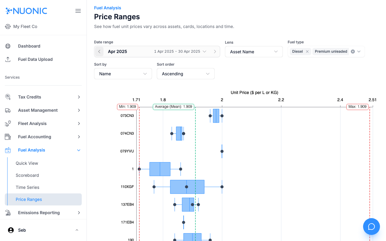
Sort byandSort orderto rank results. - Review the box-and-whisker chart showing the unit price spread for each item — the box covers the middle range of prices paid, the centre dot is the mean, and the whiskers extend to the minimum and maximum.
Screenshots
The Price Ranges chart displays unit price variation per asset (or card/location) as a box plot. The box shows the interquartile range, the centre dot is the average, and the whiskers reach the minimum and maximum prices recorded.
Troubleshooting
- If the chart is empty, ensure fuel records are present for the selected period and fuel type.
- Switch the
LenstoCardorLocationif asset-level data is sparse.